COMPANY: Primo Ceramic Grills, Broilmaster grills
DATE: 2024
TYPE: POP Display
When you step into a showroom, well branded companies are immediately recognizable by a few key elements. Key brand colors and textures help differentiate floor space from other brands, as well as help with branding as a whole.
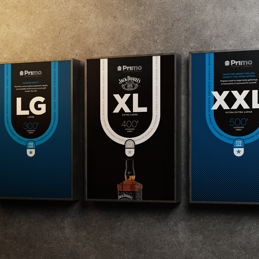
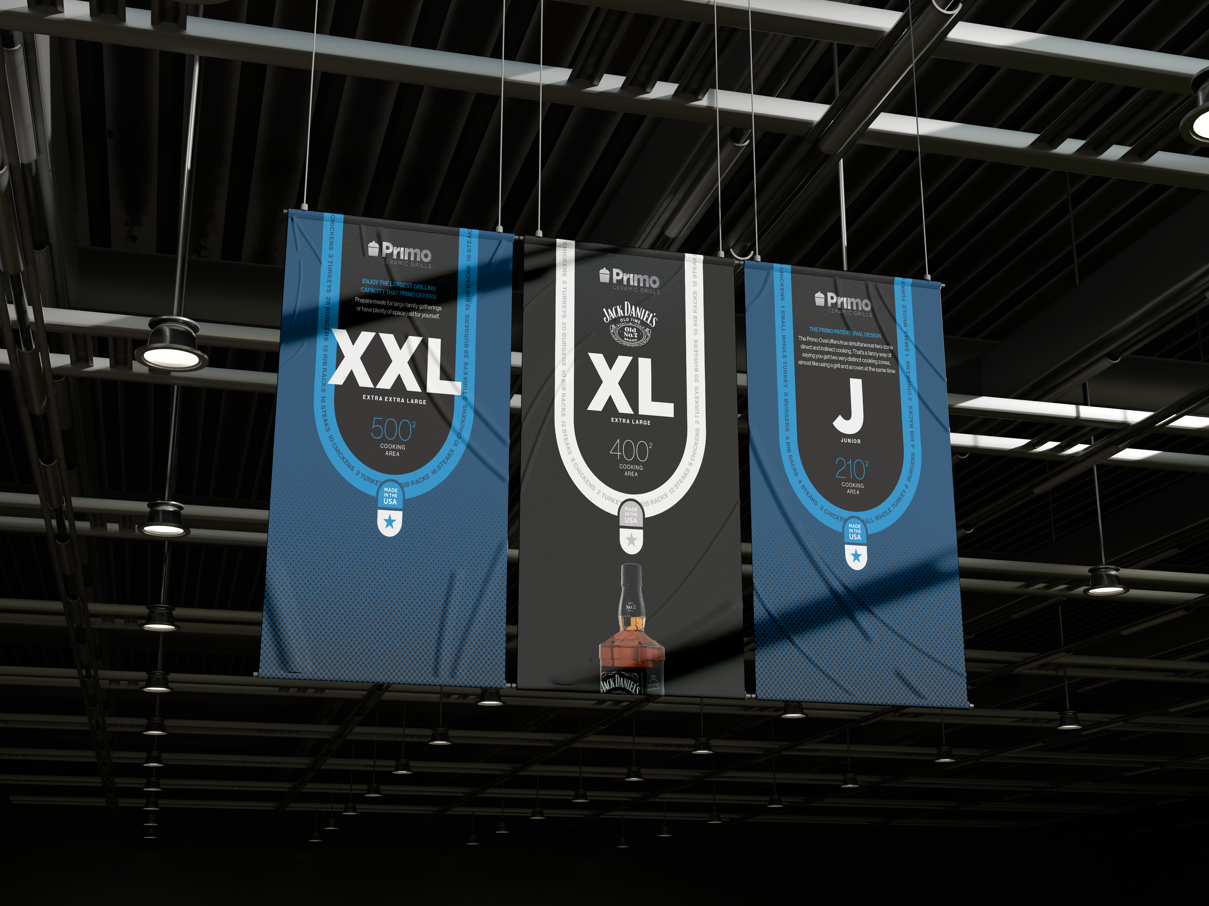
Primo Ceramic Grills initial showroom branding was white and red. Initial brand research told us that the color red was taken by another competitor in the market, and white does not work as a branding color on its own. We eventually found that blue was not being utilized by any of the major ceramic grill companies, so we paired 2 vibrant blues with black to represent the black finish on a Primo grill. Taking it further, we added an oval shape to all of our point of purchase and showroom signage to represent the patented oval shape of a Primo grill.
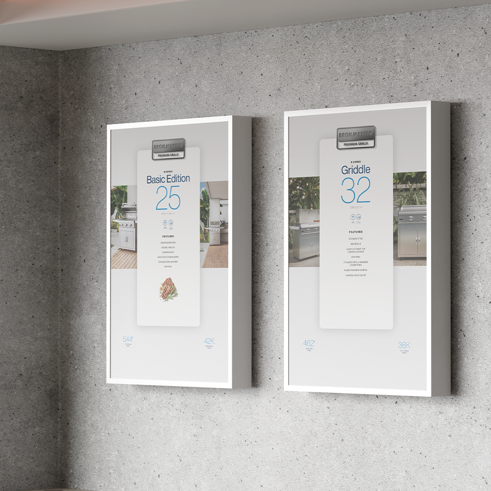
Broilmaster Grills is targeted to a higher end clientele. So the existing blue colours were pulled back, in favour of a higher end white and light grey. Since Broilmaster and Primo are both owned by the same company, we ensured that they used the same blue colours for constancy. For large signage, key information about the grill’s size and capacity is highlighted prominently, using large fonts and visual icons to illustrate how many people can be served or the volume of food it can accommodate.